掌握 transition 属性的核心用法,理解如何针对特定属性(颜色、透明度、全部)进行优化。
熟练控制动画时长(Duration)和缓动函数(Timing Function),打造自然流畅的交互体验。
学会使用内置的关键帧动画(animate-spin, animate-pulse, animate-bounce, animate-ping)解决加载、通知和引导场景。
理解 group-hover 和 focus 状态下的过渡触发机制。
能够组合过渡与动画,制作复杂的按钮交互、加载指示器和动态反馈效果。
过渡(Transition)用于在元素状态改变(如 hover, focus, active)时,让属性变化产生平滑的动画效果,避免生硬的跳变。
指定哪些 CSS 属性需要执行过渡动画。精确指定属性有助于性能优化。
transition-all: 所有可动画属性都会平滑过渡(最常用,开发效率高)。
transition-colors: 仅针对 color 和 background-color 等颜色属性。
transition-opacity: 仅针对 opacity 属性。
transition-shadow: 仅针对 box-shadow。
transition-transform: 仅针对 transform (缩放、旋转、位移)。
transition-none: 禁用过渡。
最佳实践:如果只改变颜色,使用 transition-colors 比 transition-all 性能更好,因为它避免了浏览器计算无关属性的开销。
控制动画持续的时间,单位为毫秒 (ms)。
duration-75: 75ms (极快,适合微交互)。
duration-100, duration-150: 快速响应。
duration-300: 默认标准速度,适合大多数 UI 交互。
duration-500, duration-700, duration-1000: 慢速,适合大幅度的视觉变化或强调效果。
控制动画的速度曲线(加速度)。
ease-linear: 匀速运动,机械感强,少用于 UI 交互。
ease-in: 加速运动,起步慢,结束快。
ease-out: 减速运动,起步快,结束慢(最自然,符合物理惯性)。
ease-in-out: 先加速后减速,平滑对称。
按钮与卡片的平滑交互
<!DOCTYPE html>
<html lang="zh-CN">

<head>
    <meta charset="UTF-8">
    <title>Tailwind Auto Cols 对比演示</title>
    <script src="https://cdn.tailwindcss.com"></script>
</head>

<body>
    <div class="p-8 bg-gray-50 space-y-8">

        <!-- 场景 1: 颜色与阴影的平滑过渡 -->
        <div class="flex flex-wrap gap-6">
            <!-- 基础按钮:仅颜色过渡 -->
            <button
                class="px-6 py-3 bg-blue-600 text-white font-medium rounded-lg transition-colors duration-300 ease-in-out hover:bg-blue-700 focus:ring-4 focus:ring-blue-300">
                颜色过渡 (transition-colors)
            </button>

            <!-- 高级按钮:颜色 + 阴影 + 变换 -->
            <button
                class="px-6 py-3 bg-indigo-600 text-white font-medium rounded-lg shadow-md transition-all duration-300 ease-out hover:shadow-lg hover:-translate-y-1 hover:bg-indigo-700 active:scale-95">
                全能过渡 (transition-all)
            </button>
        </div>

        <!-- 场景 2: 卡片悬停效果 -->
        <div class="max-w-sm bg-white rounded-xl overflow-hidden shadow-lg cursor-pointer group">
            <div class="h-48 bg-gray-200 overflow-hidden">
                <!-- 图片放大效果:仅 transform 过渡 -->
                <img src="https://zhanweifu.com/600x400/cccccc/ffffff" alt="Card Image"
                    class="w-full h-full object-cover transition-transform duration-700 ease-out group-hover:scale-110">
            </div>
            <div class="p-6">
                <h3
                    class="font-bold text-lg text-gray-900 mb-2 transition-colors duration-300 group-hover:text-blue-600">
                    卡片标题
                </h3>
                <p class="text-gray-600 text-sm">
                    鼠标悬停时,图片缓慢放大,标题颜色平滑变化。注意图片使用了 duration-700 以获得更优雅的效果。
                </p>
            </div>
        </div>

    </div>
</body>
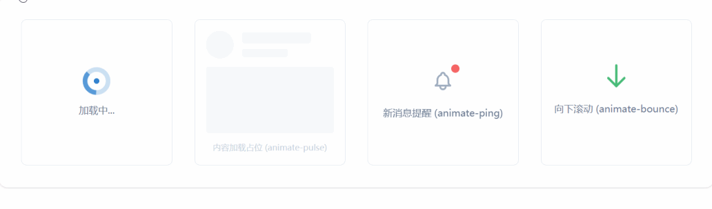
</html>Tailwind 提供了一组预设的无限循环动画,适用于加载状态、通知提示和吸引注意力。
animate-spin: 匀速旋转 360 度。
应用场景: 数据加载中、提交表单等待、刷新图标。
配合: 常与 duration-1000 或自定义速度配合,但默认速度通常合适。
animate-pulse: opacity 在 0.5 到 1 之间缓慢闪烁。
应用场景: 骨架屏(Skeleton Screen)、表示“正在处理”、“录制中”或低优先级提示。
animate-bounce: 上下弹跳,模拟重力效果。
应用场景: 提示用户向下滚动、新消息到达、强调重要操作按钮。
animate-ping: 类似雷达扫描,元素会迅速放大并淡出。
应用场景: 实时通知红点、在线状态指示器、地图上的定位点。
加载状态与通知系统
<!DOCTYPE html>
<html lang="zh-CN">

<head>
    <meta charset="UTF-8">
    <title>Tailwind Auto Cols 对比演示</title>
    <script src="https://cdn.tailwindcss.com"></script>
</head>

<body>
    <div class="grid grid-cols-1 md:grid-cols-2 lg:grid-cols-4 gap-8 p-8 bg-white rounded-xl shadow">

        <!-- 场景 1: 加载指示器 (Spin) -->
        <div class="flex flex-col items-center justify-center p-4 border rounded-lg">
            <div class="relative">
                <svg class="animate-spin h-10 w-10 text-blue-600" xmlns="http://www.w3.org/2000/svg" fill="none"
                    viewBox="0 0 24 24">
                    <circle class="opacity-25" cx="12" cy="12" r="10" stroke="currentColor" stroke-width="4"></circle>
                    <path class="opacity-75" fill="currentColor"
                        d="M4 12a8 8 0 018-8V0C5.373 0 0 5.373 0 12h4zm2 5.291A7.962 7.962 0 014 12H0c0 3.042 1.135 5.824 3 7.938l3-2.647z">
                    </path>
                </svg>
                <!-- 可选:中心加个小点 -->
                <div class="absolute inset-0 flex items-center justify-center">
                    <div class="h-2 w-2 bg-blue-600 rounded-full"></div>
                </div>
            </div>
            <p class="mt-3 text-sm text-gray-600 font-medium">加载中...</p>
        </div>

        <!-- 场景 2: 骨架屏 (Pulse) -->
        <div class="p-4 border rounded-lg space-y-3">
            <div class="flex items-center space-x-3">
                <div class="h-10 w-10 bg-gray-200 rounded-full animate-pulse"></div>
                <div class="flex-1 space-y-2">
                    <div class="h-4 bg-gray-200 rounded w-3/4 animate-pulse"></div>
                    <div class="h-3 bg-gray-200 rounded w-1/2 animate-pulse"></div>
                </div>
            </div>
            <div class="h-24 bg-gray-200 rounded animate-pulse"></div>
            <p class="text-xs text-gray-400 text-center">内容加载占位 (animate-pulse)</p>
        </div>

        <!-- 场景 3: 通知红点 (Ping) -->
        <div class="flex flex-col items-center justify-center p-4 border rounded-lg relative">
            <button class="relative p-2 text-gray-500 hover:text-gray-700">
                <!-- 铃铛图标 -->
                <svg class="h-8 w-8" fill="none" stroke="currentColor" viewBox="0 0 24 24">
                    <path stroke-linecap="round" stroke-linejoin="round" stroke-width="2"
                        d="M15 17h5l-1.405-1.405A2.032 2.032 0 0118 14.158V11a6.002 6.002 0 00-4-5.659V5a2 2 0 10-4 0v.341C7.67 6.165 6 8.388 6 11v3.159c0 .538-.214 1.055-.595 1.436L4 17h5m6 0v1a3 3 0 11-6 0v-1m6 0H9">
                    </path>
                </svg>

                <!-- 脉冲红点 -->
                <span
                    class="absolute top-0 right-0 block h-3 w-3 rounded-full ring-2 ring-white bg-red-500 animate-ping"></span>
                <span class="absolute top-0 right-0 block h-3 w-3 rounded-full bg-red-500"></span>
            </button>
            <p class="mt-3 text-sm text-gray-600 font-medium">新消息提醒 (animate-ping)</p>
        </div>

        <!-- 场景 4: 引导弹跳 (Bounce) -->
        <div class="flex flex-col items-center justify-center p-4 border rounded-lg">
            <div class="animate-bounce">
                <svg class="h-10 w-10 text-green-500" fill="none" stroke="currentColor" viewBox="0 0 24 24">
                    <path stroke-linecap="round" stroke-linejoin="round" stroke-width="2"
                        d="M19 14l-7 7m0 0l-7-7m7 7V3"></path>
                </svg>
            </div>
            <p class="mt-2 text-sm text-gray-600 font-medium">向下滚动 (animate-bounce)</p>
        </div>

    </div>
</body>

</html>虽然内置动画很强大,但真实场景往往需要更精细的控制,比如暂停动画、延迟执行或结合多种过渡。
animation-play-state: Tailwind 默认不直接提供 paused 类,但可以通过任意值语法 -[paused] 或自定义 CSS 实现。
场景: 鼠标悬停时暂停加载动画,或悬停时开始弹跳。
delay-75, delay-100, delay-300, delay-500, delay-700, delay-1000: 控制过渡开始前的等待时间。
场景: staggered animation(阶梯动画),让列表项依次出现。
阶梯式加载列表
<!DOCTYPE html>
<html lang="zh-CN">

<head>
    <meta charset="UTF-8">
    <title>Tailwind Auto Cols 对比演示</title>
    <script src="https://cdn.tailwindcss.com"></script>
</head>

<body>
    <div class="p-8 bg-gray-900 rounded-xl text-white">
        <h3 class="text-xl font-bold mb-6">阶梯式入场动画</h3>

        <ul class="space-y-4">
            <!-- 第一项:无延迟 -->
            <li
                class="bg-gray-800 p-4 rounded-lg shadow transform translate-y-4 opacity-0 animate-[fadeIn_0.5s_ease-out_forwards]">
                <div class="flex items-center justify-between">
                    <span>任务一:需求分析</span>
                    <span class="text-green-400 text-sm">已完成</span>
                </div>
                <!-- 注:此处演示概念,实际 Tailwind 需配置 keyframes 或使用插件,下方用标准类模拟 -->
            </li>

            <!-- 使用标准 Transition + Delay 模拟阶梯效果 (JS 控制添加类名或纯 CSS 配合 group) -->
            <!-- 这里演示纯 CSS 的 hover 阶梯效果 -->
            <div class="flex space-x-2 mt-8">
                <div
                    class="w-10 h-10 bg-blue-500 rounded-full transition-all duration-500 delay-0 hover:scale-125 hover:bg-blue-400">
                </div>
                <div
                    class="w-10 h-10 bg-indigo-500 rounded-full transition-all duration-500 delay-100 hover:scale-125 hover:bg-indigo-400">
                </div>
                <div
                    class="w-10 h-10 bg-purple-500 rounded-full transition-all duration-500 delay-200 hover:scale-125 hover:bg-purple-400">
                </div>
                <div
                    class="w-10 h-10 bg-pink-500 rounded-full transition-all duration-500 delay-300 hover:scale-125 hover:bg-pink-400">
                </div>
                <div
                    class="w-10 h-10 bg-red-500 rounded-full transition-all duration-500 delay-400 hover:scale-125 hover:bg-red-400">
                </div>
            </div>
            <p class="mt-2 text-sm text-gray-400">鼠标悬停在此区域,圆点将依次放大 (delay-*)</p>
        </ul>

        <!-- 场景:悬停暂停旋转 -->
        <div class="mt-8 flex items-center space-x-4">
            <div class="group">
                <svg class="animate-spin h-12 w-12 text-yellow-400 group-hover:[animation-play-state:paused]"
                    xmlns="http://www.w3.org/2000/svg" fill="none" viewBox="0 0 24 24">
                    <circle class="opacity-25" cx="12" cy="12" r="10" stroke="currentColor" stroke-width="4"></circle>
                    <path class="opacity-75" fill="currentColor"
                        d="M4 12a8 8 0 018-8V0C5.373 0 0 5.373 0 12h4zm2 5.291A7.962 7.962 0 014 12H0c0 3.042 1.135 5.824 3 7.938l3-2.647z">
                    </path>
                </svg>
                <p class="text-xs text-center mt-2 text-gray-400">悬停暂停</p>
            </div>
        </div>
    </div>
</body>

</html>
注意:Tailwind 默认配置中可能不包含 animation-play-state 的直接类名,上述示例使用了任意值语法 group-hover:[animation-play-state:paused],这是 Tailwind v3+ 的强大特性。