掌握盒阴影(Box Shadow)的各级别应用,利用 shadow-lg 至 shadow-xl 构建界面层级,理解 shadow-inner 的特殊用途。
熟练运用透明度(Opacity)控制元素显隐,区分元素整体透明与背景透明的差异。
学会使用模糊(Blur)、亮度(Brightness)和对比度(Contrast)滤镜,实现毛玻璃效果、图片悬停特效及状态反馈。
能够组合多种滤镜类名,制作现代化的卡片悬停态、加载遮罩及艺术化背景。
理解滤镜对性能的影响,并在实际项目中合理使用。
Box Shadow
阴影是 Material Design 等设计语言的核心,用于在 Z 轴上区分元素层级,暗示“高度”和“可点击性”。
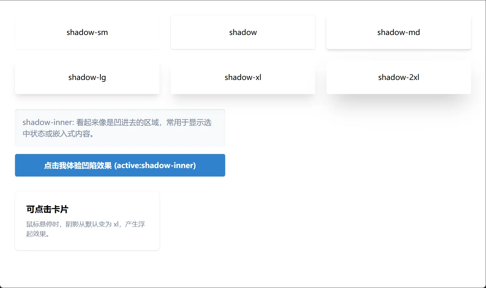
Tailwind 提供了一套基于物理高度的预设阴影:
shadow-sm: 极轻微阴影,用于微妙的凸起或输入框聚焦。
shadow: 默认阴影,适用于普通卡片、下拉菜单。
shadow-md: 中等阴影,用于悬浮的卡片或模态框。
shadow-lg: 大阴影,用于重要的弹出层、通知或强调内容。
shadow-xl: 极大阴影,极具戏剧性,常用于 Hero 区域的中心元素或大型模态框。
shadow-2xl: 超大阴影(部分版本支持),极度夸张的悬浮感。
shadow-none: 移除所有阴影,常用于重置或扁平化设计。
shadow-inner: 内阴影。常用于表示“凹陷”状态,如被按下的按钮、输入框内部或嵌入式的容器。
层级展示与交互反馈
<!DOCTYPE html>
<html lang="zh-CN">

<head>
    <meta charset="UTF-8">
    <title>Tailwind Auto Cols 对比演示</title>
    <script src="https://cdn.tailwindcss.com"></script>
</head>

<body>
    <div class="p-8 bg-gray-50 space-y-8">

        <!-- 场景 1: 阴影层级阶梯 -->
        <div class="grid grid-cols-2 md:grid-cols-3 gap-6">
            <div class="bg-white p-6 rounded text-center shadow-sm">shadow-sm</div>
            <div class="bg-white p-6 rounded text-center shadow">shadow</div>
            <div class="bg-white p-6 rounded text-center shadow-md">shadow-md</div>
            <div class="bg-white p-6 rounded text-center shadow-lg">shadow-lg</div>
            <div class="bg-white p-6 rounded text-center shadow-xl">shadow-xl</div>
            <div class="bg-white p-6 rounded text-center shadow-2xl">shadow-2xl</div>
        </div>

        <!-- 场景 2: 内部阴影 (凹陷感) -->
        <div class="space-y-4 max-w-md">
            <div class="p-4 bg-gray-100 rounded shadow-inner">
                <p class="text-gray-600">shadow-inner: 看起来像是凹进去的区域,常用于显示选中状态或嵌入式内容。</p>
            </div>

            <button
                class="w-full py-3 bg-blue-600 text-white font-bold rounded shadow active:shadow-inner active:bg-blue-700 transition-all">
                点击我体验凹陷效果 (active:shadow-inner)
            </button>
        </div>

        <!-- 场景 3: 悬停阴影增强 -->
        <div class="grid grid-cols-1 md:grid-cols-3 gap-6">
            <div class="bg-white p-6 rounded-lg shadow hover:shadow-xl transition-shadow duration-300 cursor-pointer">
                <h3 class="font-bold text-lg mb-2">可点击卡片</h3>
                <p class="text-gray-600 text-sm">鼠标悬停时,阴影从默认变为 xl,产生浮起效果。</p>
            </div>
        </div>

    </div>
</body>

</html>Opacity
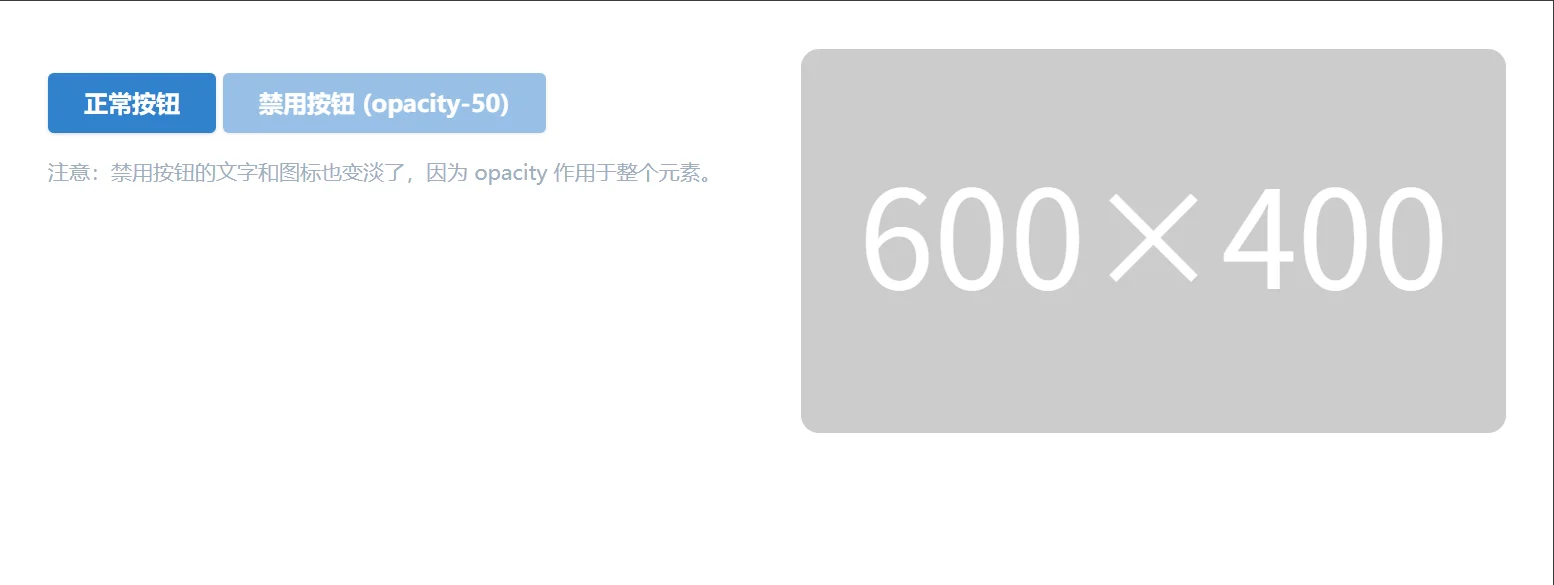
透明度用于控制元素的整体可见性,常用于禁用状态、遮罩层或渐入渐出动画。
opacity-0: 完全不可见(但仍占据空间,不同于 hidden)。
opacity-25, opacity-50, opacity-75: 25%, 50%, 75% 不透明度。
opacity-100: 完全不透明(默认)。
opacity-{value}: 影响整个元素及其所有子元素(包括文本、图标、边框)。
bg-opacity-{value} (前课内容): 仅影响背景色,子元素保持清晰。
禁用状态与遮罩
<!DOCTYPE html>
<html lang="zh-CN">

<head>
    <meta charset="UTF-8">
    <title>Tailwind Auto Cols 对比演示</title>
    <script src="https://cdn.tailwindcss.com"></script>
</head>

<body>
    <div class="grid grid-cols-1 md:grid-cols-2 gap-8 p-8">

        <!-- 场景 1: 禁用状态 -->
        <div class="space-y-4">
            <button class="px-6 py-2 bg-blue-600 text-white font-bold rounded shadow">
                正常按钮
            </button>

            <!-- 禁用按钮:降低透明度 + 指针禁用 -->
            <button disabled
                class="px-6 py-2 bg-blue-600 text-white font-bold rounded shadow opacity-50 cursor-not-allowed">
                禁用按钮 (opacity-50)
            </button>

            <p class="text-sm text-gray-500">
                注意:禁用按钮的文字和图标也变淡了,因为 opacity 作用于整个元素。
            </p>
        </div>

        <!-- 场景 2: 图片遮罩层 -->
        <div class="relative w-full h-64 rounded-xl overflow-hidden group">
            <img src="https://zhanweifu.com/600x400/cccccc/ffffff" alt="Demo" class="w-full h-full object-cover">

            <!-- 悬停时显示的黑色遮罩 -->
            <!-- 默认 opacity-0,悬停时 opacity-100,配合 transition -->
            <div
                class="absolute inset-0 bg-black opacity-0 group-hover:opacity-60 transition-opacity duration-300 flex items-center justify-center">
                <span
                    class="text-white font-bold text-lg transform translate-y-4 group-hover:translate-y-0 transition-transform duration-300">
                    查看详情
                </span>
            </div>
        </div>

    </div>
</body>

</html>Tailwind CSS 将复杂的 CSS filter 属性封装为直观的类名,让你轻松处理图像和背景效果。
Blur
用于创建景深效果、毛玻璃效果或隐藏敏感信息。
blur-sm, blur, blur-md, blur-lg, blur-xl: 不同程度的高斯模糊。
blur-none: 移除模糊。
Brightness
调整元素的明暗程度,常用于图片悬停变亮或变暗。
brightness-0 到 brightness-200: 0% (全黑) 到 200% (极亮)。
brightness-50: 变暗一半,常用于图片上方的文字遮罩替代方案。
brightness-150: 提亮 50%,用于悬停高亮。
Contrast
调整颜色的反差。
contrast-0 到 contrast-200: 0% (灰度图) 到 200% (高反差)。
contrast-50: 降低对比度,产生褪色、梦幻感。
contrast-150: 增加对比度,使图像更锐利。
图片画廊与毛玻璃特效
<!DOCTYPE html>
<html lang="zh-CN">

<head>
    <meta charset="UTF-8">
    <title>Tailwind Auto Cols 对比演示</title>
    <script src="https://cdn.tailwindcss.com"></script>
</head>

<body>
    <div class="p-8 space-y-8 bg-gray-900 min-h-screen">

        <!-- 场景 1: 图片悬停特效 (亮度 + 模糊) -->
        <h3 class="text-white text-xl font-bold mb-4">图片交互特效</h3>
        <div class="grid grid-cols-1 md:grid-cols-3 gap-6">

            <!-- 卡片 1: 悬停变亮 -->
            <div class="group relative overflow-hidden rounded-xl aspect-video">
                <img src="https://zhanweifu.com/600x400/cccccc/ffffff"
                    class="w-full h-full object-cover transition-all duration-500 group-hover:brightness-150 group-hover:scale-105"
                    alt="Bright">
                <div class="absolute inset-0 bg-black/40 group-hover:bg-transparent transition-colors"></div>
            </div>

            <!-- 卡片 2: 悬停去色 (对比度 0) -->
            <div class="group relative overflow-hidden rounded-xl aspect-video">
                <img src="https://zhanweifu.com/600x400/cccccc/ffffff"
                    class="w-full h-full object-cover grayscale contrast-50 group-hover:grayscale-0 group-hover:contrast-100 transition-all duration-500"
                    alt="Color">
            </div>

            <!-- 卡片 3: 悬停模糊 (隐私保护效果) -->
            <div class="group relative overflow-hidden rounded-xl aspect-video">
                <img src="https://zhanweifu.com/600x400/cccccc/ffffff"
                    class="w-full h-full object-cover blur-md group-hover:blur-none transition-all duration-300"
                    alt="Blur">
                <div class="absolute inset-0 flex items-center justify-center pointer-events-none">
                    <span
                        class="bg-black/70 text-white px-3 py-1 rounded text-xs group-hover:opacity-0 transition-opacity">点击解锁</span>
                </div>
            </div>
        </div>

        <!-- 场景 2: 毛玻璃效果 (Backdrop Blur) -->
        <!-- 注意:这里使用了 backdrop-blur,它是作用于元素背后的区域 -->
        <div class="relative h-64 rounded-2xl overflow-hidden flex items-center justify-center">
            <!-- 背景图 -->
            <img src="https://zhanweifu.com/600x400/cccccc/ffffff" class="absolute inset-0 w-full h-full object-cover" alt="Background">

            <!-- 毛玻璃卡片 -->
            <div
                class="relative z-10 bg-white/30 backdrop-blur-md border border-white/40 p-8 rounded-xl shadow-xl text-center">
                <h4 class="text-2xl font-bold text-white mb-2">毛玻璃效果</h4>
                <p class="text-white/90">使用 backdrop-blur-md 和 bg-white/30</p>
                <p class="text-xs text-white/70 mt-2">背景内容被模糊,但卡片内容清晰</p>
            </div>
        </div>

    </div>
</body>

</html>