掌握圆角(Border Radius)的多种形态,从微调到全圆,打造符合现代审美的卡片与按钮。
灵活控制边框的宽度、颜色和样式(实线、虚线、点线),适应不同视觉需求。
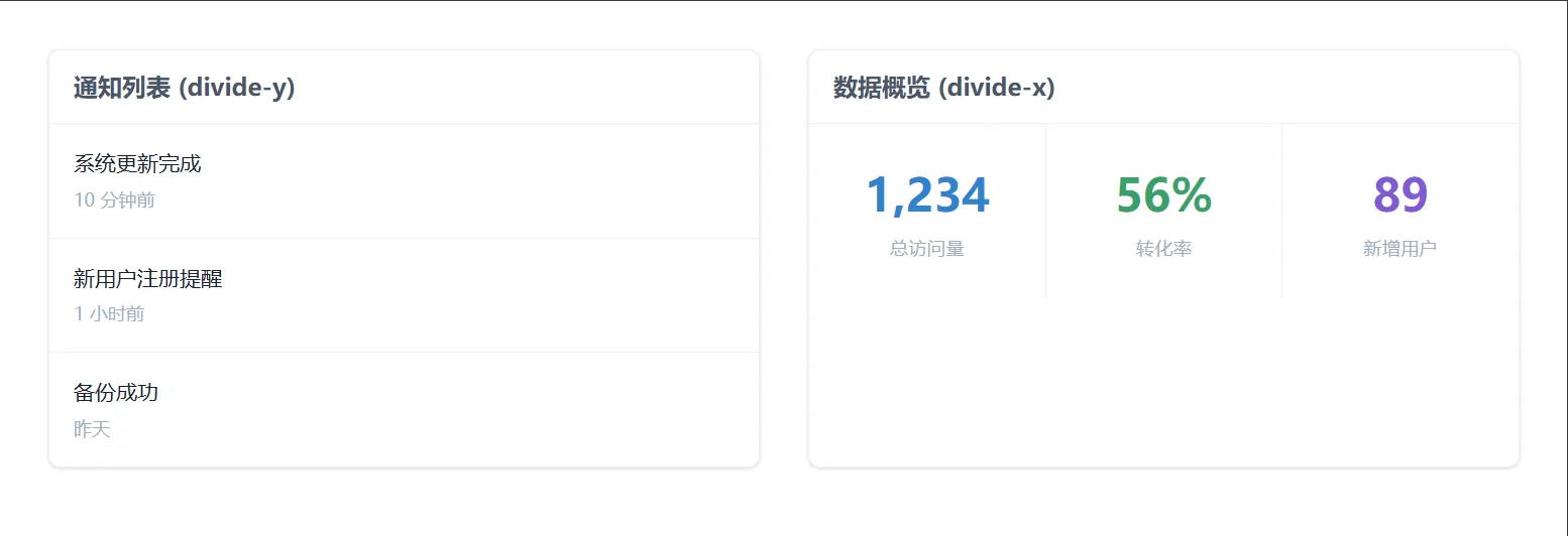
学会使用 divide-* 系列工具类,优雅地处理列表、网格中的元素分割,无需手动管理子元素的 border。
理解单边边框控制(如 border-t)的应用场景,实现局部装饰效果。
通过实战案例,制作包含圆角卡片、虚线上传区和分割线列表的完整 UI 组件。
Border Radius
圆角是软化界面、提升亲和力的关键。Tailwind 提供了一套基于 rem 的语义化圆角类名。
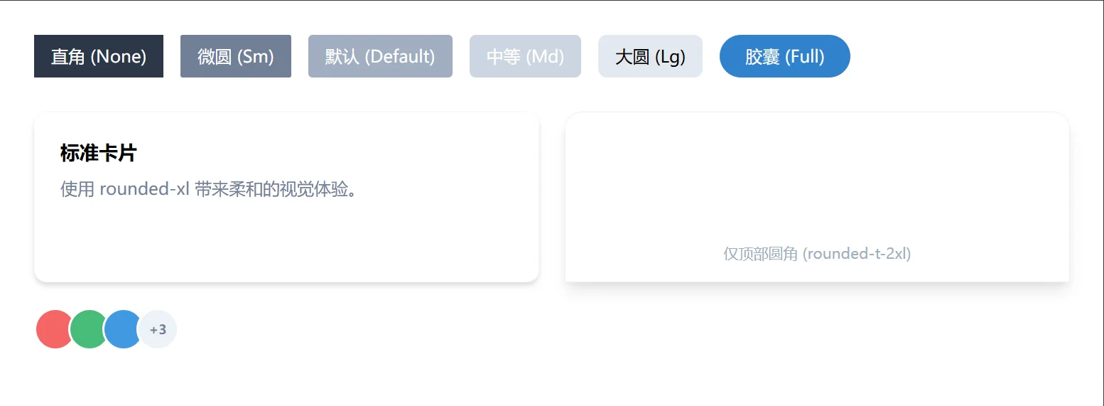
rounded-none: 0px。直角,适合严肃、硬朗的设计风格或数据表格。
rounded-sm: 0.125rem (2px)。微调,几乎看不出的圆润。
rounded: 0.25rem (4px)。默认圆角,最通用的选择,适用于大多数按钮和卡片。
rounded-md: 0.375rem (6px)。稍大一点的圆角,现代 UI 常用。
rounded-lg: 0.5rem (8px)。明显的圆润感,常用于卡片容器。
rounded-xl, rounded-2xl, rounded-3xl: 更大的圆角,流行于移动端设计和“气泡”风格。
rounded-full: 9999px。完全圆形,专用于头像、胶囊型按钮(Pill buttons)或标签。
只需对特定角落进行圆角处理:
rounded-t-lg: 仅顶部两角圆角(常用于模态框、选项卡)。
rounded-b-lg: 仅底部两角圆角。
rounded-l-lg, rounded-r-lg: 仅左侧或右侧。
rounded-tl-lg: 仅左上角(其他同理:tr, bl, br)。
多样化的圆角应用
<!DOCTYPE html>
<html lang="zh-CN">

<head>
    <meta charset="UTF-8">
    <title>Tailwind Auto Cols 对比演示</title>
    <script src="https://cdn.tailwindcss.com"></script>
</head>

<body>
    <div class="p-8 bg-gray-50 space-y-8">

        <!-- 场景 1: 按钮与标签的圆角演变 -->
        <div class="flex flex-wrap gap-4 items-center">
            <button class="px-4 py-2 bg-gray-800 text-white rounded-none">直角 (None)</button>
            <button class="px-4 py-2 bg-gray-600 text-white rounded-sm">微圆 (Sm)</button>
            <button class="px-4 py-2 bg-gray-500 text-white rounded">默认 (Default)</button>
            <button class="px-4 py-2 bg-gray-400 text-white rounded-md">中等 (Md)</button>
            <button class="px-4 py-2 bg-gray-300 text-black rounded-lg">大圆 (Lg)</button>
            <button class="px-6 py-2 bg-blue-600 text-white rounded-full">胶囊 (Full)</button>
        </div>

        <!-- 场景 2: 卡片与模态框风格 -->
        <div class="grid grid-cols-1 md:grid-cols-2 gap-6">
            <!-- 标准卡片 -->
            <div class="bg-white p-6 rounded-xl shadow-md border border-gray-100">
                <h3 class="font-bold text-lg mb-2">标准卡片</h3>
                <p class="text-gray-600">使用 rounded-xl 带来柔和的视觉体验。</p>
            </div>

            <!-- 顶部圆角 (类似抽屉或模态框) -->
            <div
                class="bg-white rounded-t-2xl rounded-b-none shadow-lg border border-gray-200 h-40 flex items-end justify-center pb-4">
                <span class="text-gray-500 text-sm">仅顶部圆角 (rounded-t-2xl)</span>
            </div>

            <!-- 头像组合 -->
            <div class="flex -space-x-2">
                <div class="w-10 h-10 rounded-full bg-red-500 border-2 border-white"></div>
                <div class="w-10 h-10 rounded-full bg-green-500 border-2 border-white"></div>
                <div class="w-10 h-10 rounded-full bg-blue-500 border-2 border-white"></div>
                <div
                    class="w-10 h-10 rounded-full bg-gray-200 border-2 border-white flex items-center justify-center text-xs font-bold text-gray-600">
                    +3</div>
            </div>
        </div>

    </div>

</body>
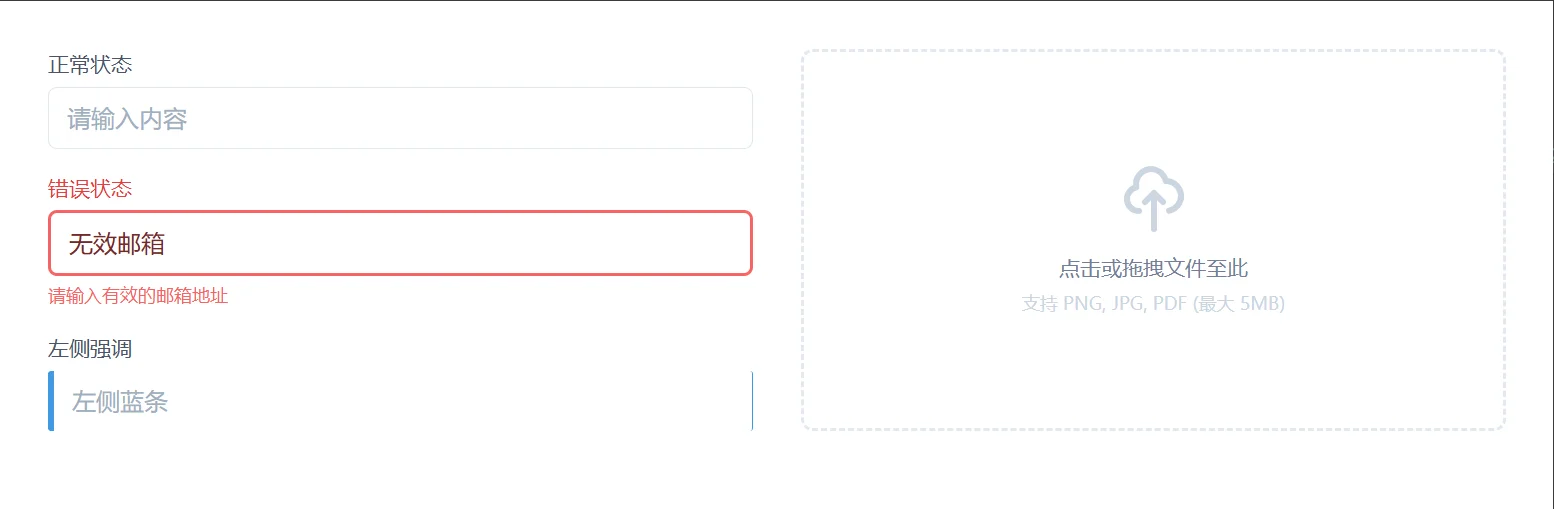
</html>除了圆角,边框的粗细、颜色和线条类型定义了元素的边界感。
Border Width
border-0: 移除边框。
border: 默认 1px。
border-2, border-4, border-8: 逐步加粗。
定向宽度: border-t-2 (仅上边), border-b-4 (仅下边), border-l-4 (左边强调线) 等。
Border Color
格式:border-{color}-{shade}。
示例:border-gray-300 (常用分割线), border-red-500 (错误状态), border-blue-600 (选中状态)。
提示:边框颜色也可以配合透明度使用,如 border-blue-500/50。
Border Style
border-solid: 实线(默认)。
border-dashed: 虚线,常用于“拖拽上传”区域。
border-dotted: 点线,较少用,有时用于辅助提示。
border-double: 双线。
border-none: 无边框。
表单状态与上传区域
<!DOCTYPE html>
<html lang="zh-CN">

<head>
    <meta charset="UTF-8">
    <title>Tailwind Auto Cols 对比演示</title>
    <script src="https://cdn.tailwindcss.com"></script>
</head>

<body>
    <div class="grid grid-cols-1 md:grid-cols-2 gap-8 p-8">

        <!-- 场景 1: 表单输入框的状态反馈 -->
        <div class="space-y-4">
            <div>
                <label class="block text-sm font-medium text-gray-700 mb-1">正常状态</label>
                <input type="text"
                    class="w-full border border-gray-300 rounded-md px-3 py-2 focus:outline-none focus:ring-2 focus:ring-blue-500 focus:border-transparent"
                    placeholder="请输入内容">
            </div>

            <div>
                <label class="block text-sm font-medium text-red-600 mb-1">错误状态</label>
                <input type="text" value="无效邮箱"
                    class="w-full border-2 border-red-500 rounded-md px-3 py-2 text-red-900 placeholder-red-300 focus:outline-none focus:ring-2 focus:ring-red-500">
                <p class="text-xs text-red-500 mt-1">请输入有效的邮箱地址</p>
            </div>

            <div>
                <label class="block text-sm font-medium text-gray-700 mb-1">左侧强调</label>
                <input type="text"
                    class="w-full border-l-4 border-blue-500 border-y border-r border-gray-300 rounded-sm px-3 py-2"
                    placeholder="左侧蓝条">
            </div>
        </div>

        <!-- 场景 2: 虚线上传区域 -->
        <div
            class="border-2 border-dashed border-gray-300 rounded-lg p-8 flex flex-col items-center justify-center text-center hover:border-blue-500 hover:bg-blue-50 transition-colors cursor-pointer group">
            <svg class="w-12 h-12 text-gray-400 group-hover:text-blue-500 mb-3" fill="none" stroke="currentColor"
                viewBox="0 0 24 24">
                <path stroke-linecap="round" stroke-linejoin="round" stroke-width="2"
                    d="M7 16a4 4 0 01-.88-7.903A5 5 0 1115.9 6L16 6a5 5 0 011 9.9M15 13l-3-3m0 0l-3 3m3-3v12"></path>
            </svg>
            <p class="text-sm text-gray-600 font-medium">点击或拖拽文件至此</p>
            <p class="text-xs text-gray-400 mt-1">支持 PNG, JPG, PDF (最大 5MB)</p>
        </div>

    </div>


</body>

</html>Divide Utilities
在处理列表、菜单或网格布局时,需要在子元素之间添加分割线。手动给每个子元素添加 border-b 会导致最后一个元素多余一条线,或者需要复杂的 :last-child 选择器。Tailwind 的 divide-* 系列完美解决了这个问题。
divide-{direction} 类名应用于父容器,它会自动在所有直接子元素之间添加边框。
divide-y: 在子元素之间添加水平分割线(相当于给除第一个外的所有子元素加 border-top)。
divide-x: 在子元素之间添加垂直分割线(相当于给除第一个外的所有子元素加 border-left)。
divide-y-reverse / divide-x-reverse: 反转边框位置(用于调整边框重叠时的层级)。
divide-gray-200: 设置分割线颜色。
divide-y-2: 设置分割线宽度为 2px。
列表与网格分割
<!DOCTYPE html>
<html lang="zh-CN">

<head>
    <meta charset="UTF-8">
    <title>Tailwind Auto Cols 对比演示</title>
    <script src="https://cdn.tailwindcss.com"></script>
</head>

<body>
    <div class="grid grid-cols-1 lg:grid-cols-2 gap-8 p-8">

        <!-- 场景 1: 垂直列表分割 (最常用) -->
        <div class="bg-white rounded-lg shadow border border-gray-200 overflow-hidden">
            <div class="bg-gray-50 px-4 py-3 border-b border-gray-200">
                <h3 class="font-bold text-gray-700">通知列表 (divide-y)</h3>
            </div>
            <!-- 父容器添加 divide-y divide-gray-200 -->
            <ul class="divide-y divide-gray-200">
                <li class="p-4 hover:bg-gray-50 transition">
                    <p class="text-sm font-medium text-gray-900">系统更新完成</p>
                    <p class="text-xs text-gray-500 mt-1">10 分钟前</p>
                </li>
                <li class="p-4 hover:bg-gray-50 transition">
                    <p class="text-sm font-medium text-gray-900">新用户注册提醒</p>
                    <p class="text-xs text-gray-500 mt-1">1 小时前</p>
                </li>
                <li class="p-4 hover:bg-gray-50 transition">
                    <p class="text-sm font-medium text-gray-900">备份成功</p>
                    <p class="text-xs text-gray-500 mt-1">昨天</p>
                </li>
                <!-- 注意:最后一个元素下方没有分割线,完美! -->
            </ul>
        </div>

        <!-- 场景 2: 水平网格分割 (类似表格列) -->
        <div class="bg-white rounded-lg shadow border border-gray-200 overflow-hidden">
            <div class="bg-gray-50 px-4 py-3 border-b border-gray-200">
                <h3 class="font-bold text-gray-700">数据概览 (divide-x)</h3>
            </div>
            <!-- 父容器添加 flex 和 divide-x -->
            <div class="flex divide-x divide-gray-200">
                <div class="flex-1 p-6 text-center">
                    <p class="text-3xl font-bold text-blue-600">1,234</p>
                    <p class="text-xs text-gray-500 uppercase tracking-wide mt-1">总访问量</p>
                </div>
                <div class="flex-1 p-6 text-center">
                    <p class="text-3xl font-bold text-green-600">56%</p>
                    <p class="text-xs text-gray-500 uppercase tracking-wide mt-1">转化率</p>
                </div>
                <div class="flex-1 p-6 text-center">
                    <p class="text-3xl font-bold text-purple-600">89</p>
                    <p class="text-xs text-gray-500 uppercase tracking-wide mt-1">新增用户</p>
                </div>
                <!-- 注意:最右侧元素右边没有分割线 -->
            </div>
        </div>

    </div>
</body>

</html>