理解 Tailwind CSS 间距系统的核心计量单位(0.25rem/4px)及其换算逻辑。
熟练掌握 Padding(内边距)和 Margin(外边距)的全方位控制类名,包括轴向简写。
学会使用 mx-auto 实现块级元素的水平居中,解决常见布局难题。
掌握 space-x 和 space-y 实用类,替代传统的 margin 手动计算,实现子元素间的自动均分间距。
能够根据设计稿快速推断出对应的 Tailwind 间距类名,提升开发效率。
在 Tailwind CSS 中,间距(Spacing)是构建视觉层次和“呼吸感”的关键。其核心设计理念是基于一个统一的标尺。
基础单位换算
Tailwind 的间距标尺默认基于 0.25rem ( 即 4px,假设浏览器根字体大小为 16px)。
数值映射: 类名中的数字 n 代表 n * 0.25rem。
计算公式: spacing = n * 4px。
注:除了数字,Tailwind 还支持 px, full, screen 等特殊值。
Padding 用于控制元素内部内容与边框之间的距离。它不会改变元素在文档流中的位置,但会增加元素的总尺寸。
全向控制:
p-4: 四边内边距均为 1rem (16px)。
轴向控制:
px-4: 水平方向 (左 + 右) 内边距。
py-4: 垂直方向 (上 + 下) 内边距。
单边控制:
pt-4 (Top): 上内边距。
pr-4 (Right): 右内边距。
pb-4 (Bottom): 下内边距。
pl-4 (Left): 左内边距。
按钮与卡片的内边距应用
<!DOCTYPE html>
<html lang="zh-CN">
<head>
<meta charset="UTF-8">
<title>Tailwind Auto Cols 对比演示</title>
<script src="https://cdn.tailwindcss.com"></script>
</head>
<body>
<div class="flex flex-col gap-6 p-6 bg-gray-50">
<!-- 标准按钮:四周均匀内边距 -->
<button class="bg-blue-600 text-white font-bold py-3 px-6 rounded hover:bg-blue-700 transition">
点击我
</button>
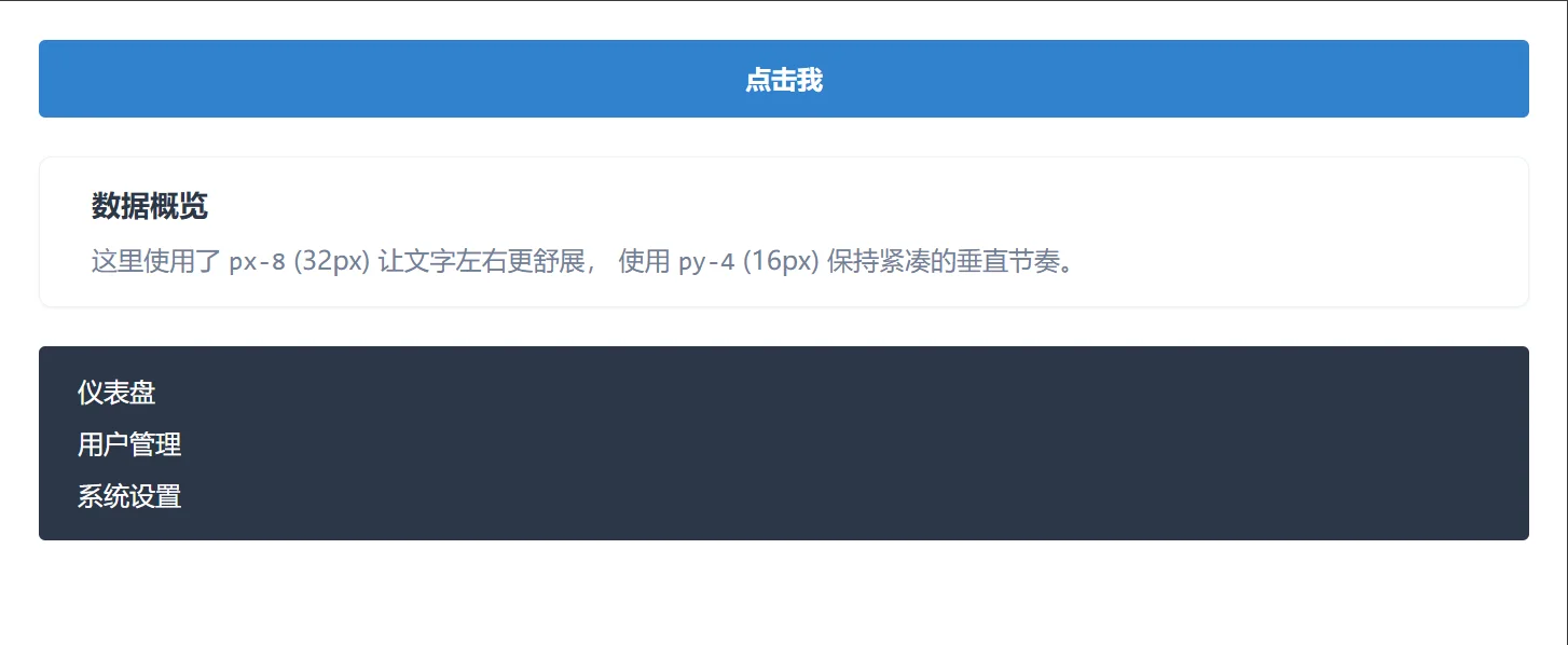
<!-- 扁平化卡片:水平内边距较大,垂直较小 -->
<div class="bg-white border border-gray-200 rounded-lg shadow-sm px-8 py-4">
<h3 class="text-lg font-bold text-gray-800">数据概览</h3>
<p class="text-gray-600 mt-2">
这里使用了 <code>px-8</code> (32px) 让文字左右更舒展,
使用 <code>py-4</code> (16px) 保持紧凑的垂直节奏。
</p>
</div>
<!-- 不对称布局:左侧导航栏风格 -->
<div class="bg-gray-800 text-white pl-6 pr-4 py-4 rounded">
<ul class="space-y-2">
<li class="hover:text-blue-400 cursor-pointer">仪表盘</li>
<li class="hover:text-blue-400 cursor-pointer">用户管理</li>
<li class="hover:text-blue-400 cursor-pointer">系统设置</li>
</ul>
</div>
</div>
</body>
</html>Margin 用于控制元素外部与其他元素之间的距离。它可以推动元素在文档流中的位置,甚至产生负边距(Negative Margin)。
全向控制: m-4 (四边外边距)。
轴向控制:
mx-4: 水平外边距 (左 + 右)。
my-4: 垂直外边距 (上 + 下)。
单边控制: mt-4, mr-4, mb-4, ml-4。
特殊值:
mx-auto: 水平居中神器。当元素具有固定宽度(或最大宽度)且为块级元素时,左右自动边距可使其在父容器中居中。
页面布局与元素居中
<!DOCTYPE html>
<html lang="zh-CN">
<head>
<meta charset="UTF-8">
<title>Tailwind Auto Cols 对比演示</title>
<script src="https://cdn.tailwindcss.com"></script>
</head>
<body>
<div class="bg-gray-100 min-h-screen p-8">
<!-- 场景 1: 垂直堆叠的间距控制 -->
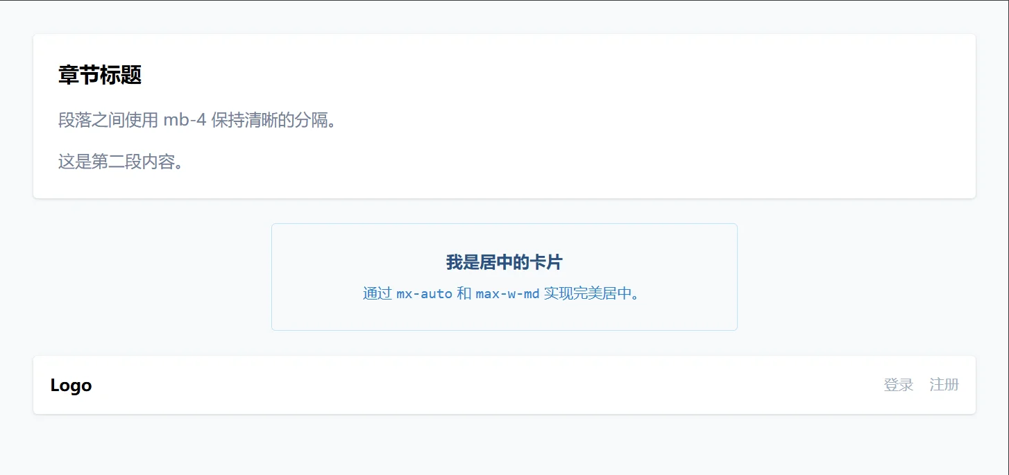
<div class="bg-white p-6 rounded shadow mb-6">
<h2 class="text-xl font-bold mb-4">章节标题</h2>
<p class="text-gray-600 mb-4">段落之间使用 mb-4 保持清晰的分隔。</p>
<p class="text-gray-600">这是第二段内容。</p>
</div>
<!-- 场景 2: 水平居中 (核心用法) -->
<!-- 注意:必须配合 w- 或 max-w- 使用才有效 -->
<div class="max-w-md w-full bg-blue-50 border border-blue-200 rounded p-6 mx-auto">
<h3 class="text-center font-bold text-blue-800">我是居中的卡片</h3>
<p class="text-center text-sm text-blue-600 mt-2">
通过 <code>mx-auto</code> 和 <code>max-w-md</code> 实现完美居中。
</p>
</div>
<!-- 场景 3: 推挤布局 (ml-auto) -->
<div class="flex items-center bg-white p-4 rounded shadow mt-6">
<span class="font-bold">Logo</span>
<!-- 这个 margin-left: auto 会将右侧导航推到最右边 -->
<nav class="ml-auto flex gap-4 text-sm text-gray-500">
<a href="#">登录</a>
<a href="#">注册</a>
</nav>
</div>
</div>
</body>
</html>在处理列表、导航栏或一组按钮时,手动给每个元素添加 mr-4 或 mb-4 既繁琐又容易出错(最后一个元素不需要间距)。Tailwind 提供了 space-* 系列类名来解决这个问题。
space-x-4 和 space-y-4 会自动给容器内的直接子元素添加间距,但不会给第一个或最后一个元素多余的外边距。
space-x-4: 子元素水平排列时,每个子元素(除第一个外)添加 margin-left: 1rem。
space-y-4: 子元素垂直排列时,每个子元素(除第一个外)添加 margin-top: 1rem。
space-x-reverse: 反转方向,改为给前一个元素添加 margin-right(主要用于 RTL 布局支持或特殊需求)。
注意:使用 space-* 的容器通常需要配合 flex 或 block (默认) 使用,且主要作用于直接子元素。
导航栏与标签组
<!DOCTYPE html>
<html lang="zh-CN">
<head>
<meta charset="UTF-8">
<title>Tailwind Auto Cols 对比演示</title>
<script src="https://cdn.tailwindcss.com"></script>
</head>
<body>
<div class="p-8 bg-white space-y-8">
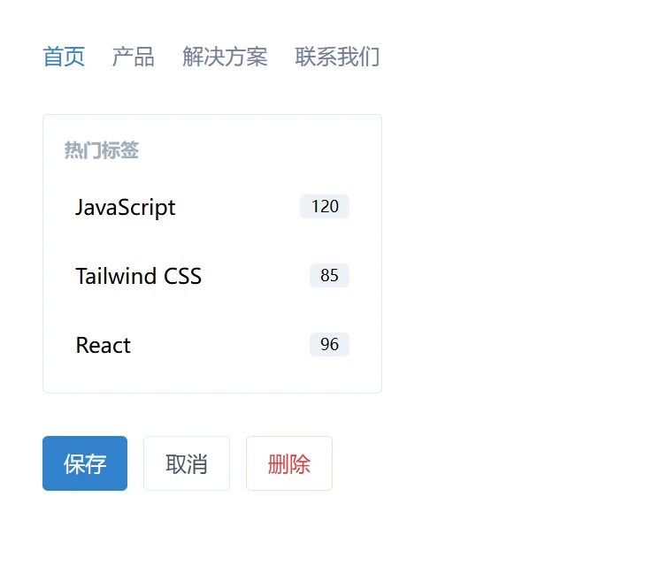
<!-- 场景 1: 水平导航栏 (替代 flex gap,兼容旧浏览器) -->
<!-- 注意:space-x 需要子元素是 block 或 inline-block,或者容器是 flex -->
<div class="flex">
<div class="space-x-4">
<a href="#" class="text-blue-600 font-medium hover:underline">首页</a>
<a href="#" class="text-gray-600 hover:text-blue-600">产品</a>
<a href="#" class="text-gray-600 hover:text-blue-600">解决方案</a>
<a href="#" class="text-gray-600 hover:text-blue-600">联系我们</a>
</div>
</div>
<!-- 场景 2: 垂直标签列表 -->
<div class="w-64 border rounded p-4">
<h4 class="font-bold mb-3 text-sm text-gray-500 uppercase">热门标签</h4>
<div class="space-y-3">
<div class="flex items-center justify-between p-2 bg-gray-50 rounded">
<span>JavaScript</span>
<span class="text-xs bg-gray-200 px-2 py-0.5 rounded">120</span>
</div>
<div class="flex items-center justify-between p-2 bg-gray-50 rounded">
<span>Tailwind CSS</span>
<span class="text-xs bg-gray-200 px-2 py-0.5 rounded">85</span>
</div>
<div class="flex items-center justify-between p-2 bg-gray-50 rounded">
<span>React</span>
<span class="text-xs bg-gray-200 px-2 py-0.5 rounded">96</span>
</div>
<!-- 最后一个元素自动没有底部的 margin,无需特殊处理 -->
</div>
</div>
<!-- 场景 3: 一组操作按钮 -->
<div class="flex space-x-3">
<button class="px-4 py-2 bg-blue-600 text-white rounded">保存</button>
<button class="px-4 py-2 bg-white border border-gray-300 text-gray-700 rounded">取消</button>
<button class="px-4 py-2 bg-red-50 text-red-600 border border-red-200 rounded">删除</button>
</div>
</div>
</body>
</html>