理解 CSS position 属性的核心作用及其对文档流(Document Flow)的影响。
掌握五种定位模式(Static, Relative, Absolute, Fixed, Sticky)的区别与应用场景。
学会使用 top, right, bottom, left 属性精确控制元素位置。
理解“定位上下文”(Positioning Context)的概念,特别是绝对定位与祖先元素的关系。
能够利用定位技术实现悬浮导航、模态框、贴纸广告等常见交互效果。
CSS 定位(Positioning)是控制网页元素在页面上放置位置的核心机制。默认情况下,元素按照 HTML 编写的顺序从上到下、从左到右排列(即正常文档流)。通过 position 属性,我们可以打破这种默认流,让元素相对于其原始位置、父容器、甚至浏览器窗口进行精确定位。
定位机制主要依赖以下两个要素:
position 属性:定义定位的模式(如 relative, absolute 等)。
偏移属性:配合 top, right, bottom, left 来指定具体的位移距离。
注意:只有当
position的值不是static时,偏移属性(top/left 等)才会生效。
position: static;
这是所有 HTML 元素的默认定位方式。
行为特征:元素完全遵循正常的文档流排列。
偏移属性:top, right, bottom, left 和 z-index 对此类元素无效。
应用场景:绝大多数常规内容(如段落、标题)都保持此状态,无需额外设置。
代码示例:
<!DOCTYPE html>
<html>
<head>
<meta charset="UTF-8">
<style>
.box {
border: 1px solid #333;
padding: 15px;
margin: 10px;
background-color: #f0f0f0;
/* 默认为 static,即使写了 top: 20px 也不会移动 */
position: static;
top: 20px;
}
</style>
</head>
<body>
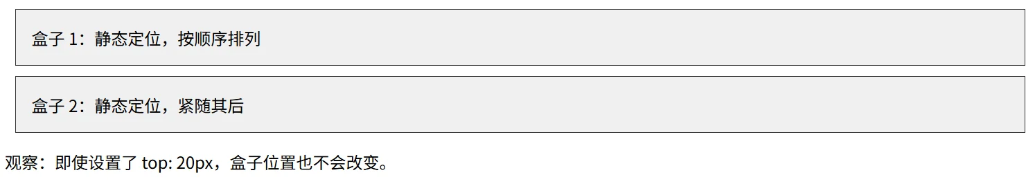
<div class="box">盒子 1:静态定位,按顺序排列</div>
<div class="box">盒子 2:静态定位,紧随其后</div>
<p>观察:即使设置了 top: 20px,盒子位置也不会改变。</p>
</body>
</html>position: relative;
相对定位是相对于元素自身在正常文档流中的原始位置进行偏移。
行为特征:
元素会按照设定的 top/left 等值移动。
关键点:元素移动后,它在文档流中原本占据的空间依然保留,不会造成其他元素填补空缺或布局塌陷。
偏移属性:top, right, bottom, left 均有效。
应用场景:
微调元素位置。
最重要用途:作为绝对定位(Absolute)子元素的“定位上下文”参考点。
代码示例:
<!DOCTYPE html>
<html>
<head>
<meta charset="UTF-8">
<style>
.box {
border: 1px solid #333;
padding: 15px;
margin: 10px;
display: inline-block;
background-color: #e3f2fd;
}
.relative-box {
position: relative;
top: 20px; /* 向下移动 20px */
left: 30px; /* 向右移动 30px */
background-color: #bbdefb;
border-color: #1976d2;
}
</style>
</head>
<body>
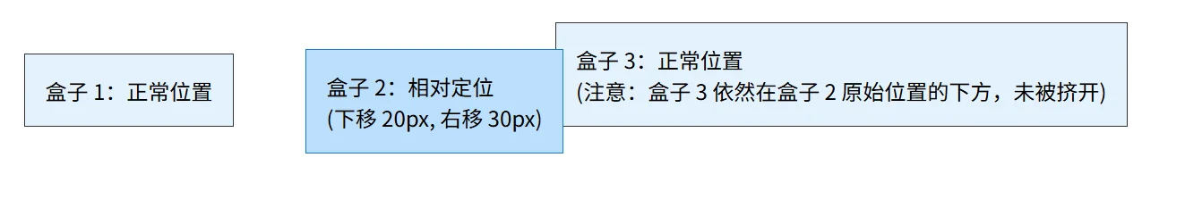
<div class="box">盒子 1:正常位置</div>
<div class="box relative-box">盒子 2:相对定位<br>(下移 20px, 右移 30px)</div>
<div class="box">盒子 3:正常位置<br>(注意:盒子 3 依然在盒子 2 原始位置的下方,未被挤开)</div>
</body>
</html>position: absolute;
绝对定位是功能最强大但也最容易出错的定位方式。
行为特征:
元素完全脱离正常文档流,不占据任何空间,后续元素会像它不存在一样排列。
定位基准:它会相对于最近的已定位祖先元素(即 position 不为 static 的祖先)进行定位。
如果没有找到已定位的祖先,则相对于初始包含块(通常是 <body> 或视口)定位。
应用场景:模态框(Modal)、下拉菜单、图片上的标签、复杂的重叠布局。
关键概念:定位上下文
为了让绝对定位元素相对于某个特定的父容器定位,必须将该父容器设置为 position: relative(通常不需要设置具体的 top/left,仅为了建立上下文)。
代码示例:
<!DOCTYPE html>
<html>
<head>
<meta charset="UTF-8">
<style>
.container {
position: relative; /* 关键:建立定位上下文 */
width: 300px;
height: 200px;
border: 2px solid #333;
margin: 20px auto;
background-color: #fff3e0;
}
.absolute-box {
position: absolute;
top: 50px;
left: 50px;
background-color: #ffccbc;
padding: 10px;
border: 1px solid #d84315;
}
.sibling {
margin-top: 10px;
color: #666;
}
</style>
</head>
<body>
<div class="container">
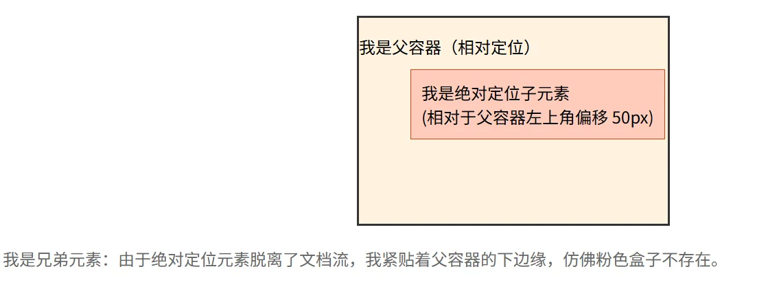
<p>我是父容器(相对定位)</p>
<div class="absolute-box">我是绝对定位子元素<br>(相对于父容器左上角偏移 50px)</div>
</div>
<div class="sibling">我是兄弟元素:由于绝对定位元素脱离了文档流,我紧贴着父容器的下边缘,仿佛粉色盒子不存在。</div>
</body>
</html>position: fixed;
固定定位类似于绝对定位,但它的参考系是浏览器视口(Viewport)。
行为特征:
元素脱离文档流。
无论页面如何滚动,元素始终固定在屏幕的指定位置。
应用场景:顶部导航栏、回到顶部按钮、悬浮客服图标、全屏遮罩层。
代码示例:
<!DOCTYPE html>
<html>
<head>
<meta charset="UTF-8">
<style>
.fixed-box {
position: fixed;
top: 10px;
right: 10px;
background-color: #c8e6c9;
padding: 15px;
border: 2px solid #2e7d32;
box-shadow: 0 2px 5px rgba(0,0,0,0.2);
}
.long-content {
height: 1500px;
padding: 20px;
background: linear-gradient(to bottom, #fff, #eee);
}
</style>
</head>
<body>
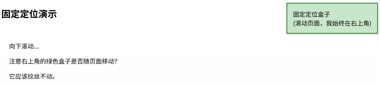
<div class="fixed-box">固定定位盒子<br>(滚动页面,我始终在右上角)</div>
<h2>固定定位演示</h2>
<div class="long-content">
<p>向下滚动...</p>
<p>注意右上角的绿色盒子是否随页面移动?</p>
<p>它应该纹丝不动。</p>
<!-- 模拟长内容 -->
<p style="margin-top: 800px;">底部内容</p>
</div>
</body>
</html>position: sticky;
粘性定位是相对定位和固定定位的混合体,表现为“阈值内的相对定位,阈值外的固定定位”。
行为特征:
元素在正常文档流中表现为 relative。
当滚动页面使得元素到达指定的阈值(如 top: 0)时,它表现为 fixed,吸附在视口边缘。
限制:一旦其父容器滚动出视口,粘性元素也会随之移出(它不能超出父容器的边界)。
必要条件:必须指定至少一个偏移值(top, right, bottom, 或 left),否则行为等同于 relative。
应用场景:表格表头固定、列表分组标题、侧边栏目录导航。
代码示例:
<!DOCTYPE html>
<html>
<head>
<meta charset="UTF-8">
<style>
.sticky-box {
position: sticky;
top: 0; /* 当滚动到距离顶部 0px 时触发吸附 */
background-color: #fff59d;
padding: 15px;
border-bottom: 2px solid #fbc02d;
font-weight: bold;
}
.content-area {
height: 1200px;
padding: 10px;
background-color: #fafafa;
}
</style>
</head>
<body>
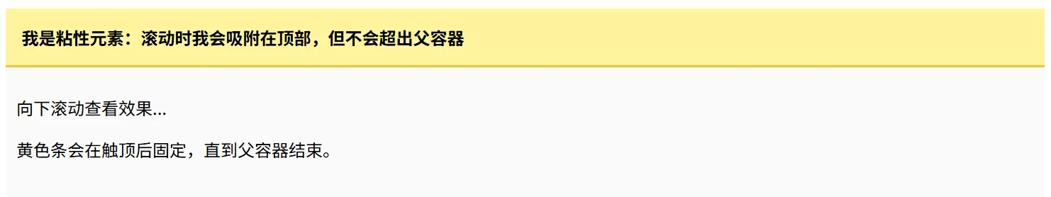
<div class="sticky-box">我是粘性元素:滚动时我会吸附在顶部,但不会超出父容器</div>
<div class="content-area">
<p>向下滚动查看效果...</p>
<p>黄色条会在触顶后固定,直到父容器结束。</p>
<p style="margin-top: 600px;">更多内容...</p>
<p style="margin-top: 400px;">底部</p>
</div>
</body>
</html>文档流影响:static 和 relative 不脱离文档流,元素仍占据原有空间;absolute 和 fixed 完全脱离文档流,不再占据空间。
参考系差异:
relative 参照自己原来的位置。
absolute 参照最近的“非 static”祖先(若无则参照 body)。
fixed 参照浏览器窗口(视口)。
sticky 在相对和固定之间动态切换,且受父容器限制。
经典组合:“父相对,子绝对” 是前端开发中最常用的布局技巧。通过将父元素设为 relative,子元素设为 absolute,可以实现子元素在父元素内部的任意精确定位,而不影响外部布局。
层级控制:定位元素(非 static)可以使用 z-index 属性来控制堆叠顺序,数值越大越靠上。
粘性陷阱:使用 sticky 时,务必确保父容器的高度足够,且必须设置 top/left 等阈值,否则无效。
场景设计:如果你想做一个“回到顶部”的按钮,它应该始终显示在屏幕右下角,无论用户滚到哪里。你会选择哪种定位方式?如果这个按钮需要在一个特定的滑动容器内部固定(而不是整个屏幕),又该怎么做?
代码调试:
.parent {
    width: 300px;
    height: 300px;
    background: gray;
}
.child {
    position: absolute;
    top: 20px;
    left: 20px;
    background: red;
}在上述代码中,.child 元素并没有出现在 .parent 的左上角内部,而是跑到了页面的左上角。请分析原因,并给出修复代码。
深入理解:position: sticky 在某些旧版浏览器或特定嵌套结构下可能失效。请思考:如果一个 sticky 元素的任意一个祖先元素设置了 overflow: hidden、overflow: auto 或 overflow: scroll,会发生什么现象?为什么?