掌握通过切换 <input> 的 type 属性实现密码可见性控制
学会使用图标(如 👁️/🙉)作为交互按钮提升用户体验
理解事件监听器在 DOM 操作中的核心作用
实践现代表单设计的最佳实践:安全与可用性兼顾
构建响应式、美观的登录输入组件
在注册或登录表单中,用户常因输错密码而反复尝试。“显示 / 隐藏密码” 功能可让用户:
核对输入内容是否正确
避免因大小写、特殊字符等导致的错误
在安全环境下临时查看密码(如移动端)
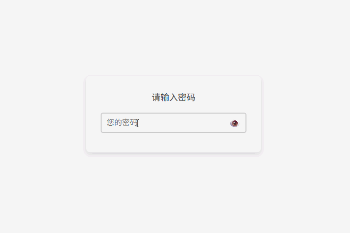
<div class="container">
  <label for="password">请输入密码</label>
  <div class="input-container">
    <input id="password" type="password" placeholder="您的密码" />
    <span class="eye-icon" id="togglePassword">👁️</span>
  </div>
</div>
结构解析:
label[for="password"]:语义化标签,提升无障碍访问支持
input[type="password"]:默认隐藏输入内容(显示为圆点)
span.eye-icon:使用 👁️ 图标作为切换按钮,不使用 <button> 避免表单意外提交
id="togglePassword":便于 JavaScript 精准绑定事件
body {
  font-family: Arial, sans-serif;
  display: flex;
  justify-content: center;
  align-items: center;
  height: 100vh;
  margin: 0;
  background-color: #f4f4f4;
}

.container {
  background-color: white;
  padding: 30px;
  border-radius: 10px;
  box-shadow: 0 4px 8px rgba(0, 0, 0, 0.1);
  width: 300px;
  text-align: center;
}

label {
  font-size: 18px;
  margin-bottom: 10px;
  display: block;
  color: #333;
}

.input-container {
  display: flex;
  align-items: center;
  position: relative;
}

input {
  width: 100%;
  padding: 10px 40px 10px 10px; /* 右侧留出图标空间 */
  margin: 10px 0;
  border: 2px solid #ccc;
  border-radius: 5px;
  font-size: 16px;
  box-sizing: border-box;
}

.eye-icon {
  position: absolute;
  right: 10px;
  cursor: pointer;
  font-size: 20px;
  color: #666;
  user-select: none; /* 禁止选中图标 */
  transition: color 0.2s;
}

.eye-icon:hover {
  color: #007bff;
}
设计亮点:
图标绝对定位:覆盖在输入框右侧,不占用额外空间
输入框内边距调整:右侧 padding 增加,防止文字被图标遮挡
悬停反馈:鼠标悬停时图标变蓝,提示可点击
禁用文本选择:避免用户误选 👁️ 符号
// 获取 DOM 元素
const passwordInput = document.getElementById('password');
const toggleIcon = document.getElementById('togglePassword');

// 绑定点击事件
toggleIcon.addEventListener('click', function () {
  if (passwordInput.type === 'password') {
    // 切换为明文显示
    passwordInput.type = 'text';
    toggleIcon.textContent = '🙈'; // 或使用 🙉 表示“已隐藏”
  } else {
    // 切换为密码隐藏
    passwordInput.type = 'password';
    toggleIcon.textContent = '👁️';
  }
});
关键机制
<!DOCTYPE html>
<html lang="zh-CN">
<head>
  <meta charset="UTF-8" />
  <meta name="viewport" content="width=device-width, initial-scale=1.0"/>
  <title>密码显示/隐藏</title>
  <style>
    body {
      font-family: Arial, sans-serif;
      display: flex;
      justify-content: center;
      align-items: center;
      height: 100vh;
      margin: 0;
      background-color: #f4f4f4;
    }
    .container {
      background-color: white;
      padding: 30px;
      border-radius: 10px;
      box-shadow: 0 4px 8px rgba(0, 0, 0, 0.1);
      width: 300px;
      text-align: center;
    }
    label {
      font-size: 18px;
      margin-bottom: 10px;
      display: block;
      color: #333;
    }
    .input-container {
      display: flex;
      align-items: center;
      position: relative;
    }
    input {
      width: 100%;
      padding: 10px 40px 10px 10px;
      margin: 10px 0;
      border: 2px solid #ccc;
      border-radius: 5px;
      font-size: 16px;
      box-sizing: border-box;
    }
    .eye-icon {
      position: absolute;
      right: 10px;
      cursor: pointer;
      font-size: 20px;
      color: #666;
      user-select: none;
      transition: color 0.2s;
    }
    .eye-icon:hover {
      color: #007bff;
    }
  </style>
</head>
<body>
  <div class="container">
    <label for="password">请输入密码</label>
    <div class="input-container">
      <input id="password" type="password" placeholder="您的密码" />
      <span class="eye-icon" id="togglePassword">👁️</span>
    </div>
  </div>

  <script>
    const passwordInput = document.getElementById('password');
    const toggleIcon = document.getElementById('togglePassword');

    toggleIcon.addEventListener('click', () => {
      if (passwordInput.type === 'password') {
        passwordInput.type = 'text';
        toggleIcon.textContent = '🙈';
      } else {
        passwordInput.type = 'password';
        toggleIcon.textContent = '👁️';
      }
    });
  </script>
</body>
</html>键盘支持:按 Enter 聚焦输入框,按 Space 切换可见性
自动隐藏:3 秒无操作后自动隐藏密码(提升安全性)
A11Y 支持:为图标添加 aria-label="显示密码" 和 role="button"
SVG 图标替代 Emoji:更稳定、可定制颜色和大小
多字段支持:封装为函数,支持多个密码框复用
// 示例:通用切换函数
function setupPasswordToggle(inputId, iconId) {
  const input = document.getElementById(inputId);
  const icon = document.getElementById(iconId);
  icon.addEventListener('click', () => {
    // ... 切换逻辑
  });
}核心原理:通过动态修改 input.type 实现密码可见性切换
用户体验:图标反馈 + 悬停效果 + 无障碍设计
安全边界:前端可见 ≠ 数据泄露,后端仍需加密处理
工程规范:分离结构、样式、行为,避免内联事件
现代实践:使用 addEventListener 而非 onclick 属性
如果页面中有“确认密码”字段,如何让两个密码框的显示 / 隐藏状态同步?
使用 Emoji 作为图标可能存在兼容性问题(如旧版 Windows)。如何改用 SVG 实现相同效果?
为什么我们不直接用 <button> 而是用 <span>?如果一定要用按钮,应如何防止表单提交?